FOUNDATION
Cream
CMYK · GENERIC0 / 2 / 6 / 4
PANTONE · CANDIDATEMatch pending
02 / QUIET HOURS — REVISED
The primary combination is green and light pastel brown: Deep Olive against a warm, light neutral. Cream is the foundation of the revised palette; Pale Sage, Walnut, Sand, and Clay bring variety without competing for attention.
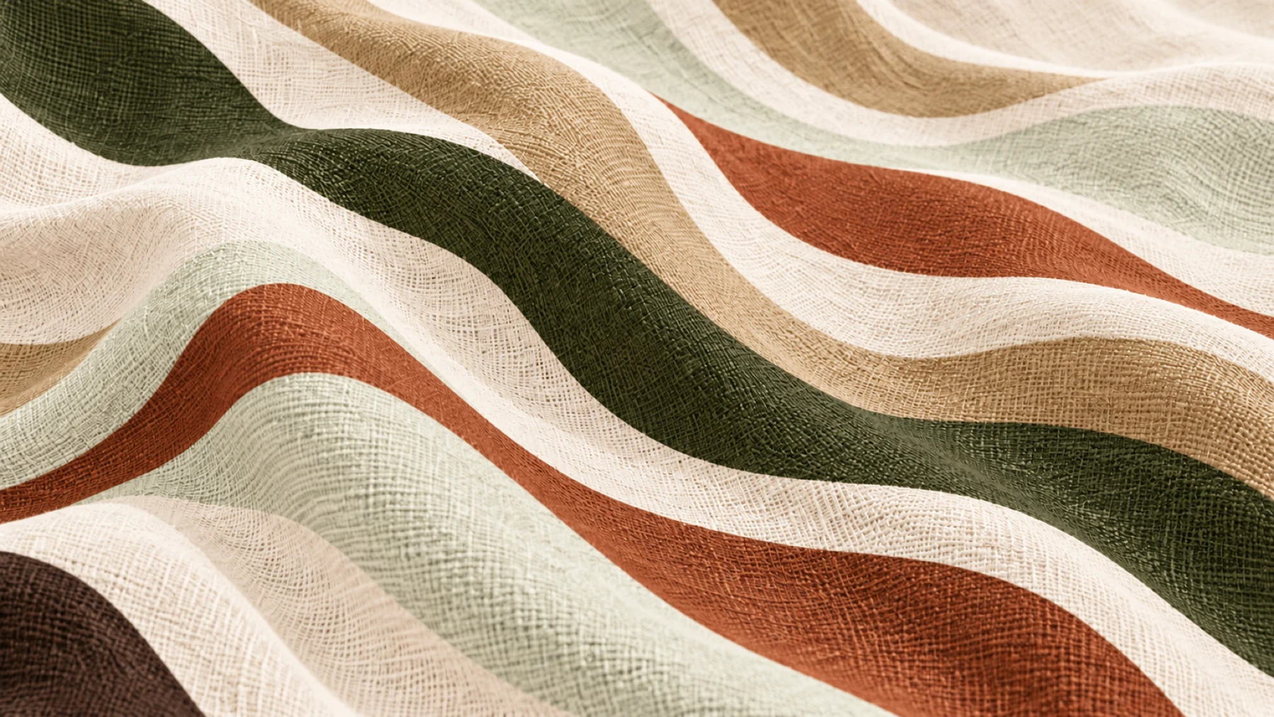
SIX COLOURS / A CLEAR HIERARCHY
CMYK · GENERIC0 / 2 / 6 / 4
PANTONE · CANDIDATEMatch pending
CMYK · GENERIC18 / 0 / 52 / 74
PANTONE · CANDIDATE5743 C
CMYK · GENERIC0 / 32 / 50 / 76
PANTONE · CANDIDATE7533 C
CMYK · GENERIC0 / 18 / 40 / 26
PANTONE · CANDIDATE4655 C
CMYK · GENERIC2 / 0 / 6 / 5
PANTONE · CANDIDATEMatch pending
CMYK · GENERIC0 / 53 / 72 / 39
PANTONE · CANDIDATE7516 C
HEX values are the digital masters. CMYK values are generic conversions; Pantone references are provisional candidates. Cream and Pale Sage await physical matching.
COLOUR IN USE / CURATED PAIRINGS
Drag or swipe through five considered pairings. Each has a role in the identity.