The expressive.
The curled L, individual rhythm, and finishing accent gave the name its character.
Previous presentationPHASE 1 / FROM THE CHOSEN DIRECTION
Option 01, “The expressive”, began with a name full of personality. Its curves now carry a wider identity — a colour world, two typefaces, a family of icons, and a rhythm that lives in the details.
See how it evolved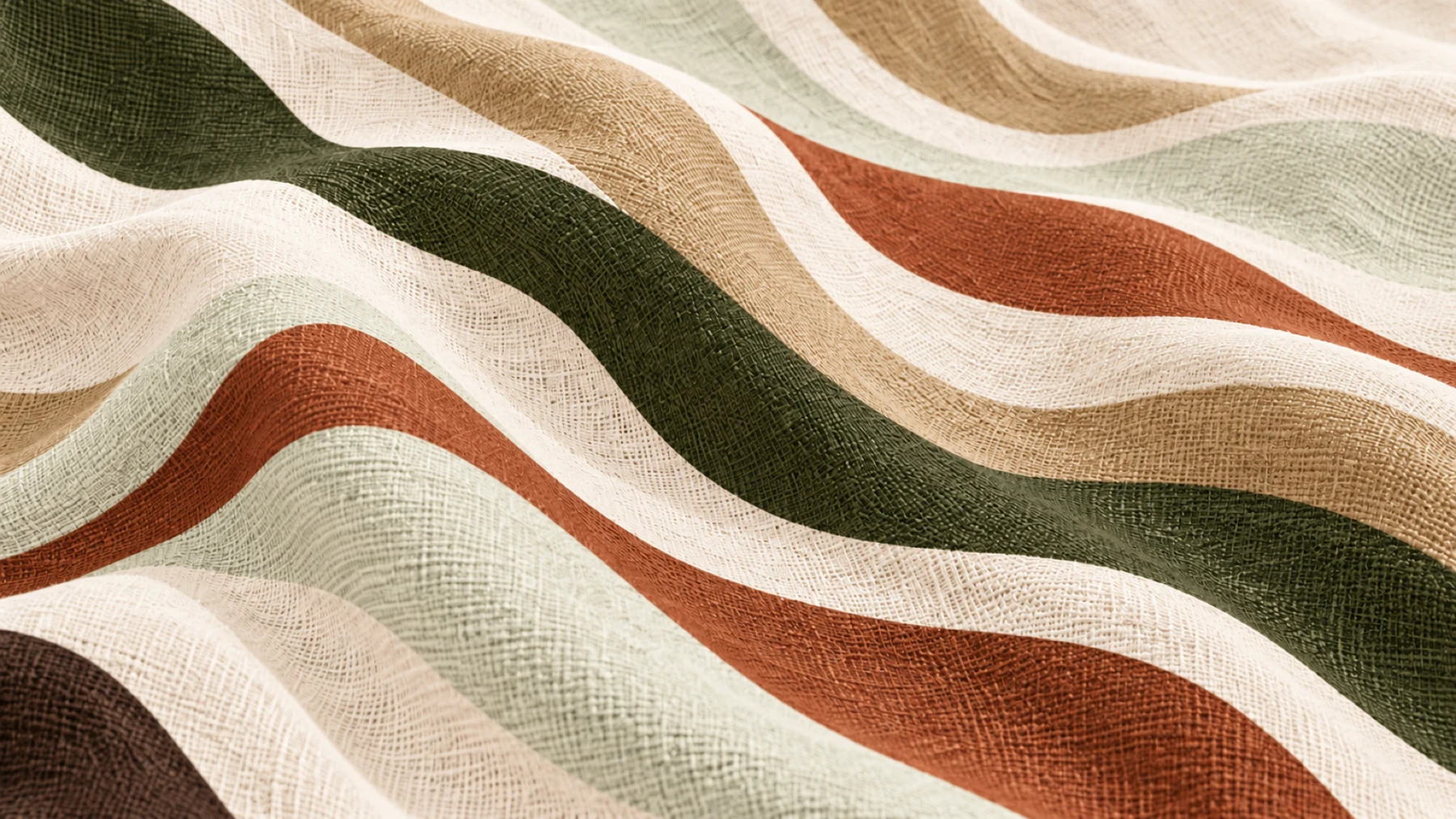 DEEP OLIVE / A LIGHTER KIND OF WARMTH
SAME STORY. MORE WAYS TO TELL IT.
The curled L, individual rhythm, and finishing accent gave the name its character.
Previous presentationLockups, the LA logo icon, Quiet Hours, Lara Display and Alt Riviera extend that first gesture.
Colour, type, icons, and pattern now work together across the guest experience.
See it togetherEXPLORE THE IDENTITY / SIX CHAPTERS
Follow the chapters in order, or step into any part of the identity.
The chosen wordmark, its lockups, and the LA logo icon.
Explore the marksDeep Olive and light neutrals lead the revised six-colour system.
Explore quiet hoursLara Display brings character. Alt Riviera makes room for the everyday.
Explore the typefaces

138 matching icons, in monochrome and green duotone.
Explore iconography
From the expressive letterforms to objects, fabrics, and surfaces.
Explore pattern & materialBring the developed elements together and share your thoughts.
Explore the conclusionTHE STORY STILL HOLDS
A mother’s middle name. A childhood home in Ilorin. The wish to share something personal with the people who come to stay. The identity has grown; that invitation remains at its heart.
Revisit the founder’s story